Our purpose
Make room for nature in everyday life. A considered plant, a quieter corner, a more connected way of living.
A LIVING IDENTITY / 2026
Plants, landscapes, and thoughtfully considered spaces.
Welcome to the Wadula brand guidelines.
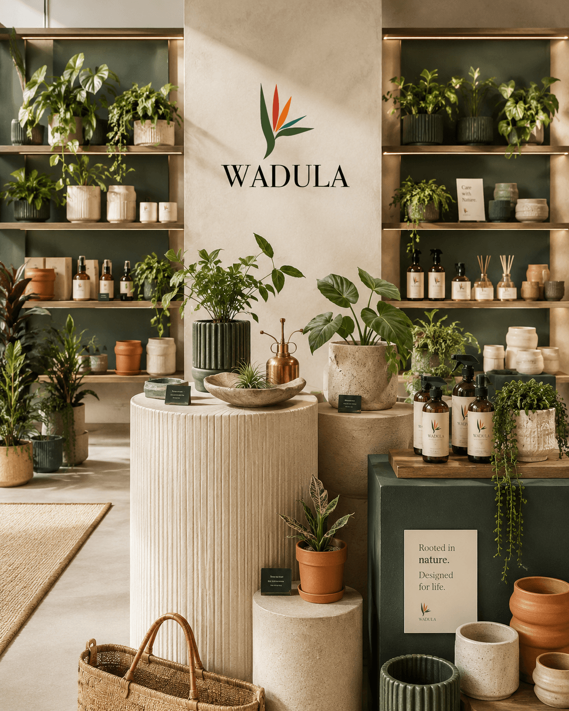
Official guidelines and logo assets are available in Drive. Reference photography and structural previews illustrate the system; application artwork and production specifications remain subject to approval.
02Brand foundation
Our foundation connects every choice we make — from an individual plant to a landscape or a complete living environment.
Nature, thoughtfully brought
into modern living.
Make room for nature in everyday life. A considered plant, a quieter corner, a more connected way of living.
Connect plants, planting, landscaping, and spatial greenery through thoughtful design, making nature feel at home in everyday life.
A world where nature is an essential part of how we live, work, and feel at home.
A thoughtful choice. A harmonious space. An enduring connection to nature.
Plants · Plant retail · Planting · Landscaping · Spatial greenery · Plant styling · Lifestyle environments · Curated nature-led experiences
A plant changes a room. Light falls differently. A quiet corner becomes a place to pause. Wadula begins with these small, meaningful shifts — bringing the living world into the spaces we make our own.
Consider the plant, the person, and the place it will call home.
Curate with intention. Give every element a reason to be there.
Let natural beauty and contemporary design sit comfortably together.
Wadula is a design-led plant, landscape and lifestyle brand that brings nature thoughtfully into modern spaces.
OUR UNIQUE VALUEPlants, landscapes, and lifestyle environments, considered together. From plant retail and planting to spatial greenery, styling, and curated nature-led experiences.
Purpose, mission, vision, values, story, promise, and differentiators are proposed editorial guidance, pending brand-owner approval.
03Our audience
A shared appreciation of thoughtful spaces. Different lives, connected by a desire to live a little greener.
Urban young professionals
A busy life. A considered home. They look for simple ways to bring calm, personality, and a little nature into their everyday spaces.
Make choosing and caring for plants feel effortless.
Design-conscious homeowners
They see plants as part of a room’s composition and value pieces that feel at home with their interiors.
Connect the right plant with the right space.
Creative & aesthetic enthusiasts
Drawn to form, texture, and the unexpected. They appreciate a distinctive perspective and honest visual storytelling.
Offer inspiration with a clear point of view.
Boutique businesses & lifestyle spaces
They create welcoming environments for others and want greenery that complements their space and experience.
Balance atmosphere, practicality, and ongoing care.
Audience groups are supplied brand direction. Persona narratives are qualitative guidance, not validated demographic research.
04Market position
We bring a design-led perspective to the plant world, with the whole living experience in view.
Plant, landscape and lifestyle design. The meeting point of horticulture, spatial greenery, and considered everyday living.
Plant retailers, landscape practices, spatial styling studios, and lifestyle brands are relevant comparison categories. A named competitor audit is to be verified.
Proposed strategic direction: connect plant selection, planting, landscaping, spatial styling, and approachable care in one coherent experience.
A desire for design-led curation and continued support. Customer research and market evidence are to be verified.
“Compete through curation,
care, and a clear point of view.”PROPOSED COMPETITIVE PRINCIPLE
05Voice & messaging
Our voice feels like a thoughtful guide: clear, quietly confident, and always human.
Welcome people in. Be thoughtful and direct without assuming a relationship.
Share practical knowledge in everyday language. Explain unfamiliar terms.
Choose fewer, better words. Let a clear idea do the work.
An invitation
“Find a little green for your everyday.”
“HURRY! Transform your life with the BEST plants!”
A product introduction
“Sculptural leaves. A quiet presence. Meet your next green companion.”
“Our revolutionary premium plant is a must-have for everyone.”
A care reminder
“A moment to check in. Feel the soil before you reach for the watering can.”
“Just water it every day. You can’t go wrong.”
Calm, clear, and reassuring. Help people make a considered choice.
Observant, inspiring, and conversational. Share a small, useful moment.
Brief and personal. Make the arrival feel thoughtful.
Patient and practical. Acknowledge the question, then offer a next step.
Messaging examples and channel guidance are proposed copy for brand-owner review.
06Logo system
A flexible family with a consistent presence. Give it space, preserve its form, and let it speak clearly.
The principal expression of the Wadula identity.
A wide composition for horizontal placements.
The compact brand signature for familiar touchpoints.
Official black artwork for monochrome reproduction.
Official white artwork for use on dark backgrounds.
Official logo artwork is available in Drive. These frames reserve space for corresponding local previews; they do not recreate the logo.
Give the identity room to breathe. The exact clear-space formula is to be finalized.
Keep the smallest details legible. Digital and print minimum sizes are to be finalized.
Choose the approved light or dark artwork for clear contrast. Avoid busy photographs behind the logo.
Never stretch, rotate, redraw, add effects, or recolor the logo outside its approved variants.
Keep original proportions.
No outlines, shadows, or textures.
Use the approved color variants.
07Color system
Rooted in green. Balanced by warm neutrals. Brought to life with considered moments of color.
Primary / Brand recognition
RGB 52, 77, 41Secondary / Quiet contrast
RGB 38, 108, 100Accent / Emphasis
RGB 201, 67, 50Accent / Energy
RGB 232, 106, 36Foundation / Space to breathe
RGB 244, 239, 230Neutral / Typography
RGB 37, 39, 33Drag or scroll to compare. Arrow keys and buttons work too.
Passes AA for normal text
Passes AA for normal text
Passes AA for normal text
Use a minimum contrast ratio of 4.5:1 for normal text and 3:1 for large text. Color alone must never communicate meaning. Verify each final combination in context.
CMYK: To be verified. Pantone: To be verified. Confirm the profile, substrate, and physical proof with your print partner before production.
08Typography
Three complementary voices. A clear foundation, an editorial expression, and precision in the smallest details.
The everyday voice. Headings, body copy, navigation, and the details that hold everything together.
Considered by nature.
ABCDEFGHIJKLMNOPQRSTUVWXYZ
abcdefghijklmnopqrstuvwxyz
0123456789 !?@&.,:;—()[]
Licensed font file pending. This specimen uses the isolated Arial fallback.
A softer, editorial note. Use for a story, a statement, or a moment worth pausing for.
Font referenceA little room to grow.
ABCDEFGHIJKLMNOPQRSTUVWXYZ
abcdefghijklmnopqrstuvwxyz
0123456789 !?@&.,:;—()[]
Open-source font · SIL Open Font License
Order in the details. Color values, specifications, file names, and system information.
Font referenceWADULA / 01 — 2026
ABCDEFGHIJKLMNOPQRSTUVWXYZ
abcdefghijklmnopqrstuvwxyz
0123456789 !?@&.,:;—()[]
Open-source font · SIL Open Font License
Make space for something living. A thoughtfully chosen plant brings texture, rhythm, and a quiet connection to the natural world.
“Good things take
a little growing.”
FOREST GREEN
HEX #344D29
RGB 52, 77, 41
Naturally considered.
A living identity
Room for nature
The thoughtful details
Good design leaves room for life to happen.
A considered collection, naturally.
These responsive sizes demonstrate hierarchy in this portal. Final web and print type scales, weights, leading, and tracking are to be finalized.
09Visual language
Organic detail within a rational frame. Shape, texture, and space create an identity that feels quietly alive.
Draw from the shape of a leaf, a growing stem, or a natural silhouette. Final botanical artwork is to be finalized.
Favor tactile paper, natural surfaces, and unforced texture. Avoid digital effects that imitate depth or shine.
Give one element the lead. Use the grid to organize organic forms, with generous unoccupied space.
Pattern and organic-form panels are composition studies. Approved visual-element files are pending.
10Photography
Honest, tactile, and quietly evocative. Real-world references for the feeling, composition, and atmosphere of our future photography.

Plants in context. Natural light, honest materials, and room to breathe.

A simple setting. Honest color. Let the product be the subject.

Unforced and present. Show the small moments that connect people and plants.
Observe the quiet rhythm of leaf structure, form, and texture.

Greenery as part of a calm, considered working environment.

A real-world reference for plant display, variety, and retail atmosphere.
All images above are reference imagery from Unsplash, not official Wadula photography. Each image includes a discreet source link.
11Layout system
A rational grid gives every element a place. Generous space lets the important things be seen.
Align with purpose.
Let the eye move naturally.
Use 12 columns as a flexible starting point. Reduce columns on smaller screens and preserve meaningful alignment.
One lead message, a supporting thought, then the details. Contrast scale and space before adding decoration.
Use purposeful crops and generous margins. Keep type off busy images and balance visual weight across the page.
Grid demonstrations are guidance. Exact margins, gutters, and production dimensions are to be finalized for each format.
12Stationery
Everyday correspondence, held to the same standard. Useful, tactile, and unmistakably considered.
A quiet first impression.
Space for the message to lead.
A quiet first impression.
Dimensions: To be finalized
Available soonSpace for the message to lead.
Dimensions: To be finalized
Available soonClear, ordered, and easy to read.
Dimensions: To be finalized
Available soonA considered arrival.
Dimensions: To be finalized
Available soonA personal moment of appreciation.
Dimensions: To be finalized
Available soonA consistent foundation for communication.
Dimensions: To be finalized
Available soonEssential details, simply arranged.
Dimensions: To be finalized
Available soonAll application previews are structural placeholders. Final artwork, dimensions, stock, and print finishes are to be finalized.
13Packaging
The experience continues beyond the plant. Packaging protects, informs, and makes every arrival feel special.
Carry a little nature with you.
An everyday companion.
Carry a little nature with you.
Dimensions: To be finalized
Available soonAn everyday companion.
Dimensions: To be finalized
Available soonThe essential introduction.
Dimensions: To be finalized
Available soonA small, recognizable signature.
Dimensions: To be finalized
Available soonHelpful advice for a living thing.
Dimensions: To be finalized
Available soonA thoughtful finishing detail.
Dimensions: To be finalized
Available soonMake the giving feel intentional.
Dimensions: To be finalized
Available soonProtection with a light touch.
Dimensions: To be finalized
Available soonChoose structures that protect living products. Confirm ventilation, stability, and handling with production partners.
Consider longevity, local recycling systems, and material suitability. Verify environmental claims before printing.
15Retail & environment
A physical expression of the same idea. Natural materials, intuitive movement, and plants given room to be themselves.
A clear, welcoming presence in the streetscape.
Guide gently. Keep information purposeful.
A clear, welcoming presence in the streetscape.
Dimensions: To be finalized
Available soonGuide gently. Keep information purposeful.
Dimensions: To be finalized
Available soonGroup thoughtfully and give each plant space.
Dimensions: To be finalized
Available soonNatural tones, comfortable materials, a quiet signature.
Dimensions: To be finalized
Available soonRetail panels are structural placeholders only. Site measurements, fabrication specifications, and uniform artwork are to be finalized.
16Digital
The same calm clarity, translated to digital spaces. Useful interactions, legible details, and an effortless journey.
Generous space, clear hierarchy, and useful interaction.
Use the approved symbol in a clear, centered field.
Generous space, clear hierarchy, and useful interaction.
Dimensions: To be finalized
Available soonUse the approved symbol in a clear, centered field.
Dimensions: To be finalized
Available soonOne primary message with an obvious next step.
Dimensions: To be finalized
Available soonA strong image, a short thought, a clear invitation.
Dimensions: To be finalized
Available soonApproved favicon artwork is pending. These frames show the required inspection sizes.
Give controls clear labels and one obvious purpose. Prioritize content, navigation, and access to information.
Support keyboards, visible focus, readable contrast, and reduced motion. Never rely on hover or color alone.
17Brand governance
Consistency is a shared responsibility. Use the current files, respect the system, and check the details before release.
Use this portal for the latest approved standards. Do not recreate artwork from screenshots or borrow files from old campaigns.
Archive superseded files, document changes, and publish a new release with a version number. Never replace an approved file silently.
Brand · asset · variant · color mode · format
wadula_logo_primary_fullcolor_rgb.svgwadula_symbol_primary_rgb.svgfinal-logo-new-2-revised-FINAL.svgApproval owner: To be finalized
Release date: To be finalized
Use approved SVG artwork for scalable, crisp digital logos. Preserve the original paths and proportions.
Use the correct resolution and transparency. Never enlarge a small raster file for large-format output.
Confirm bleed, fonts, output profile, and the printer’s requirements. A PDF is not automatically print-ready.
RGB is for screens. CMYK depends on the print process and profile. Do not treat automatic conversions as approved print colors.
Version 1.0 — 2026. This release documents supplied brand direction and proposed editorial guidance. Final production approvals remain pending.
18Downloads
The resources to bring Wadula into the world. Official files and collections are shared through Google Drive.
10 assets shown
The complete Wadula brand guideline document.
Primary, horizontal, symbol, black, and white. SVG, PNG, AI, and PSD source artwork.
Approved digital values and verified print specifications.
Type roles, hierarchy, licensing references, and specifications.
Business cards, correspondence, invoices, and email signatures.
Bags, tags, labels, care cards, and wrapping artwork.
Posts, stories, carousels, and campaign templates.
Avatars, favicons, email, and digital advertising.
Approved application presentations and editable mockup files.
The full approved brand library, organized in one shared folder.
Available assets open in Google Drive in a new tab. Final brand files will appear here as their shared links are added.
19Design & Engineering
Designed and engineered by
Brand Identity Designer
Product Engineer
14Social media
A quieter corner of the feed.
A consistent point of view, with room for life. Balance useful guidance, living spaces, and the details of the collection.
Plant stories / Considered spaces / Everyday care / Our community
Story
Source / PNGA glimpse of everyday green.
Post
Source / PNGOne image. One clear idea.
Carousel
Source / PNGA thoughtful sequence.
StorySource / PNGPreview +
Story
A glimpse of everyday green.
Dimensions: To be finalized
Available soon—PostSource / PNGPreview +
Post
One image. One clear idea.
Dimensions: To be finalized
Available soon—CarouselSource / PNGPreview +
Carousel
A thoughtful sequence.
Dimensions: To be finalized
Available soon—Reel coverSource / PNGPreview +
Reel cover
A consistent first frame.
Dimensions: To be finalized
Available soon—Product announcementSource / PNGPreview +
Product announcement
Introduce the living details.
Dimensions: To be finalized
Available soon—Educational postSource / PNGPreview +
Educational post
Practical care, simply explained.
Dimensions: To be finalized
Available soon—TestimonialSource / PNGPreview +
Testimonial
Make room for real voices.
Dimensions: To be finalized
Available soon—PromotionSource / PNGPreview +
Promotion
An invitation without urgency.
Dimensions: To be finalized
Available soon—EventSource / PNGPreview +
Event
A reason to come together.
Dimensions: To be finalized
Available soon—New collectionSource / PNGPreview +
New collection
A fresh perspective on green.
Dimensions: To be finalized
Available soon—↳Alternate imagery, breathing space, and helpful editorial content. Platform dimensions and export specifications are to be verified before release.